
Editing a component
Editing a component's content: the editing form, lists of items, images and links, and the advanced options (main page title, anchor).
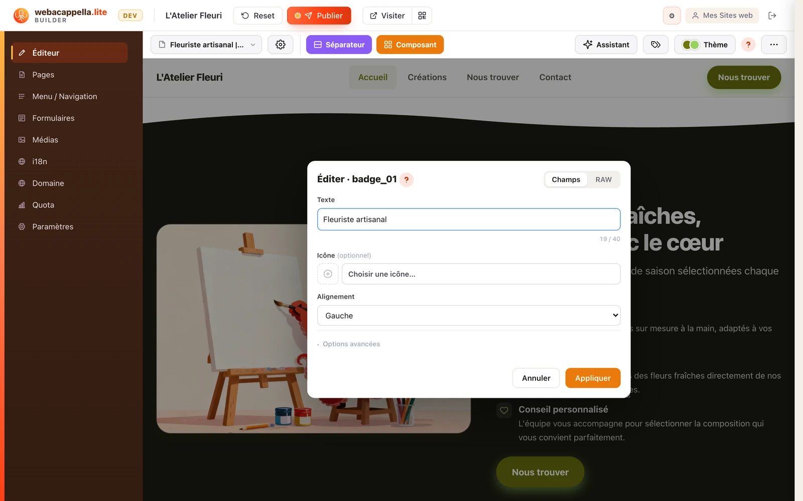
Click on a component on your page: its settings open in a form. Each field corresponds to a visible element (title, text, image, button), and your changes appear on the page immediately.
Lists of items
Many components contain a list (cards, questions and answers, prices…). You can add or remove items (+ Add, Remove): the layout adjusts by itself. The order displayed is the order of the list: to change it, rewrite the lines in the order you want.
Images and links
- Images: choose an image from your media library or import a new one: it is automatically optimised for the web.
- Links: A link can point to a page on your site, a specific section, or an external URL.
Opening, applying, cancelling
When you hover over a component, a small bar offers Edit content, Move this component and Delete this component; a double-click also opens the editor. In the form, Apply confirms your changes and Cancel (or the Esc key) closes it without changing anything. You can move the window by its title bar, to keep the page visible while you write.
Advanced options
- Main page title: on components that carry a title, this box designates the page's main heading (the "h1" for search engines). Only one per page: if several blocks are ticked, only the first one counts.
- Enable an anchor: gives a name to the component's location, so that a link can jump straight to it ("Our prices"). See Links and anchors.
Text fields display a character counter; a field marked "(optional)" can be left empty, and the component will adapt. Anything to do with the background, the margins or the seam is set on the section, not on the component: see A section’s background and Sections, separators and seams.
Adding, moving or deleting a component →