Responsive layout
WebAcappella allows you to create responsive websites that automatically adjust to different screen sizes: computer, tablet, and mobile.
The software works as a modular system based on boxes, rows, and columns.
Understanding responsive mode
- A responsive website must adapt without losing readability or usability.
- WebAcappella includes several breakpoints that allow you to adjust the layout according to the screen size.
- The three main display modes available are:
✔ Desktop mode: Display on a large screen (PC, Mac).
✔ Tablet mode: Adaptation to intermediate screens.
✔ Mobile mode: Optimized for smartphones.
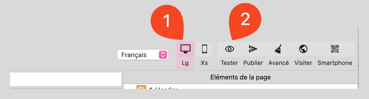
Access screen options
- Locate the icons corresponding to the different screen sizes above the workspace.
- Click on the icon to display a preview of the site at any time.
Responsive properties
- Some properties can be adapted according to the display mode (Desktop, Tablet, Mobile).
- When a setting can be changed for a specific screen, a responsive mode icon is displayed next to the parameter.
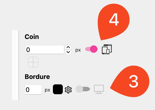
By enabling these options, each display mode will have its own setting, without affecting the others.
Another example of use: adjusting font size. Text that is too large can be difficult to read on mobile devices.
Resizing columns
Each row has one or more columns, with widths ranging from 1 to 12 units.
Enabling column mode by holding down the Option key (Mac) / Alt key (Windows) makes it easier to select columns.
When a column is selected, you can:
- Move it to reorganize the structure.
- Resize it to adjust its position in the row.
- Use a fluid layout: Columns automatically rearrange themselves to fit the screen.
- Check the resizing of columns: They must be adapted to avoid a display that is too cramped on mobile devices.
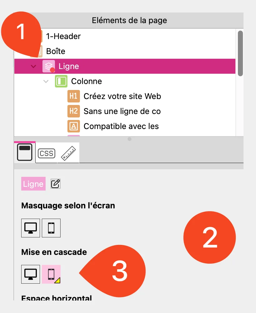
Cascade mode: Stack elements in a column
Cascade mode allows you to force the vertical stacking of elements contained in a column on a given screen.
This is particularly useful on mobile devices to avoid overly cramped horizontal layouts and improve readability.
- Select a row.
- Access the row settings (right panel).
- Enable "Cascade" mode for the currently selected screen.
- The elements in each column are automatically stacked vertically.
Use a "Break" to force a line break
The Break element forces a line to appear below the previous one on a given screen. This setting is inherited on smaller screens, ensuring better content adaptation.
- You must select a line.
- Open the element toolbar.
- Select the Break element.
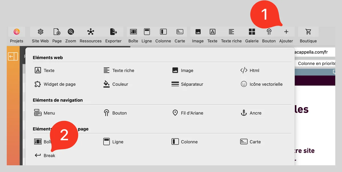
- Drag and drop the Break into a line where you want to force a line break.
⚠ A Break inserted into a line will be active on that screen and lower sizes.

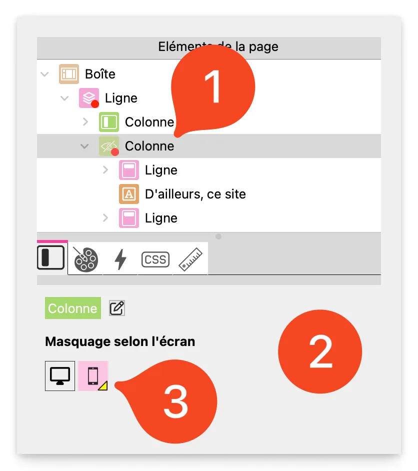
Hide elements depending on the screen
If an element is too complex for a small screen, it can be hidden depending on the screen size.
- Select an element.
- Access the visibility options (in the properties on the right).
- Check or uncheck the options to show or hide the element on Desktop, Tablet, or Mobile.
Test and finalize the display
- Switch to mobile mode regularly to check the rendering.
- Adjust margins and spacing to avoid elements being too close together.
- Use the preview (Cmd + T / Ctrl + T) to see how it will look in real conditions.
Best practices
- Use a flexible column structure for better adaptability.
- Enable Cascade mode on certain lines to avoid misaligned elements on mobile devices.
- Use a break in a row if it needs to appear below other rows on a given screen.
- Test each display mode before publication.
- Optimize images and text to ensure good readability on all screens.