Responsive layout
WebAcappella can be used to create responsive sites that automatically adjust to different screen sizes: computer, tablet and mobile.
The software works as a modular system based on boxes, rows and columns.
Understanding responsive mode
A responsive site must adapt without losing legibility or ergonomics.
WebAcappella includes several breakpoints to adjust the layout according to screen size.
The three main display modes available are :
✔ Desktop mode: Large-screen display (PC, Mac).
✔ Tablet mode: Adaptation to intermediate screens.
✔ Mobile Mode: Optimization for smartphones.
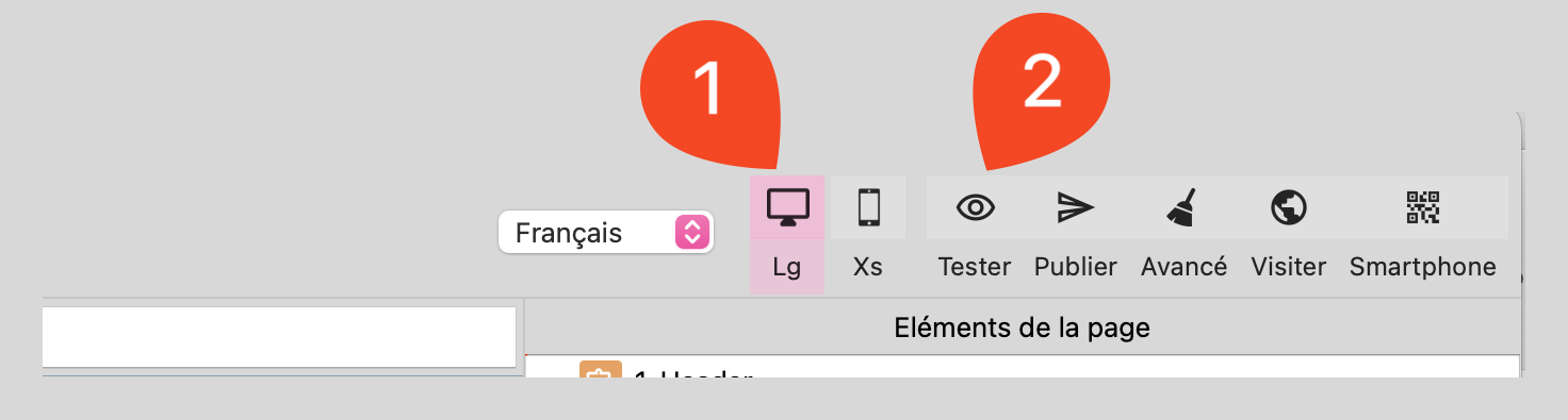
Accessing screen choices
Locate the icons for the different screen sizes above the work surface.
Click on the icon to display the site preview at any time.
Responsive properties
Some properties can be adapted according to display mode (Desktop, Tablet, Mobile).
When a setting can be modified for a specific screen, a responsive mode icon appears next to the parameter.
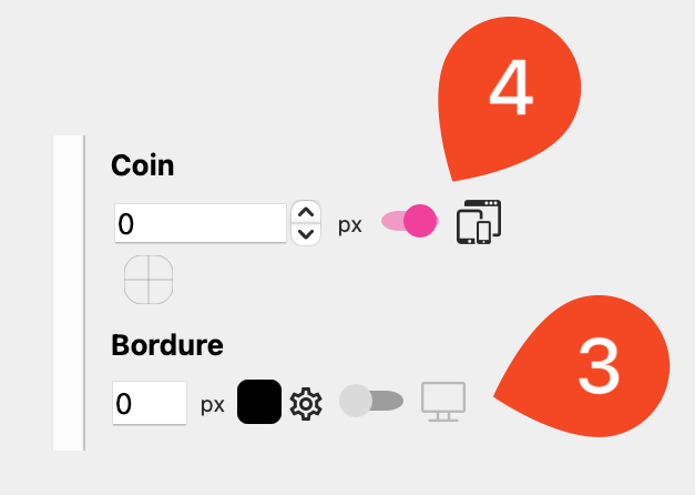
By activating these options, each display mode will have its own setting, without affecting the others.
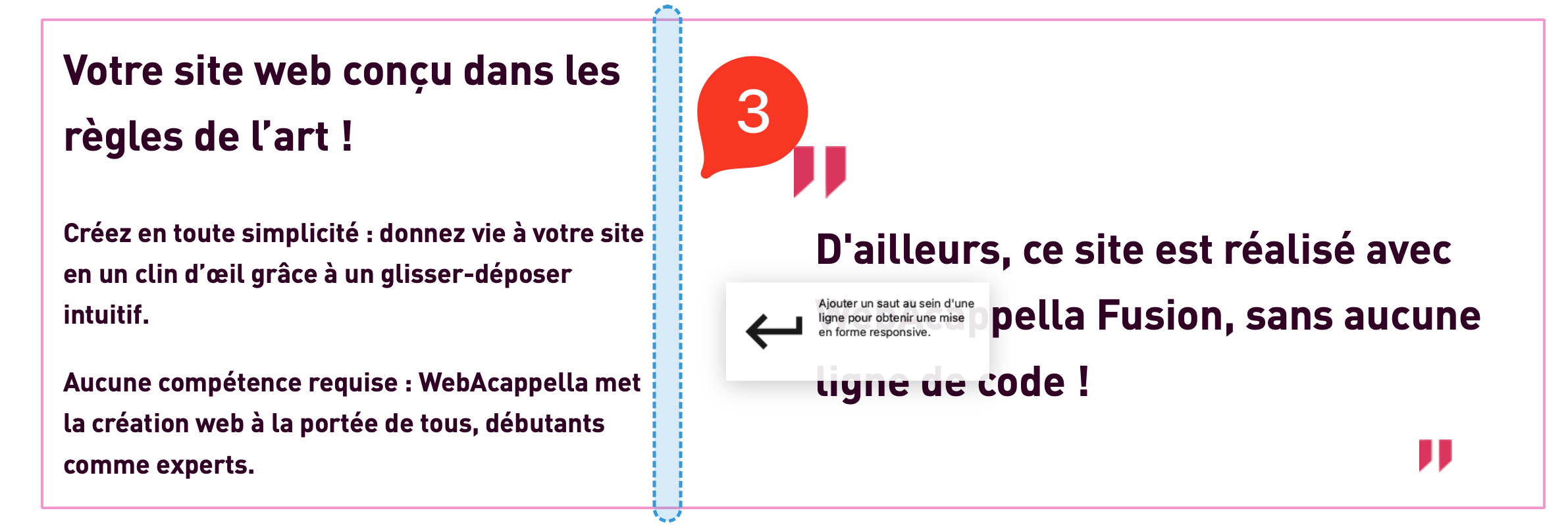
Another example: adapt font size. Text that is too large can be difficult to read on a cell phone.
Resize columns
Each row has one or more columns, ranging from 1 to 12 units wide.
Activate column mode by holding down the Option (Mac) / Alt (Windows) key to select columns more easily.
When a column is selected, you can :
Move it to reorganize the structure.
Resize it to adjust its position in the line.
Use a fluid layout: Columns automatically rearrange themselves according to the screen.
Check the resizing of columns: They must be adapted to avoid too tight a display on cell phones.
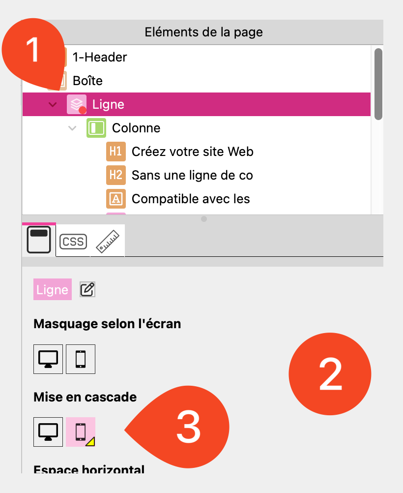
Cascade mode: Stack elements in a column
Cascade mode allows you to force vertical stacking of elements contained in a column on a given screen.
It is particularly useful on mobiles to avoid too tight a horizontal layout and improve legibility.
Select a line.
Access line parameters (right panel).
Activate “Cascade” mode for the currently selected screen.
Elements in each column are automatically stacked vertically.
Use a “Break” to force a line break
The Break element allows you to force a line to go below the previous one on a given screen. This setting is inherited on smaller screens, guaranteeing better content adaptation.
It is necessary to select a line.
Open the elements toolbar.
Select the Break element.
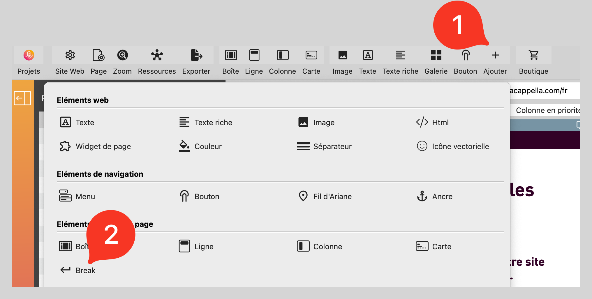
Drag and drop the Break into a line where you want to force a line break.
⚠ A Break inserted in a line will be active on this screen and smaller sizes.
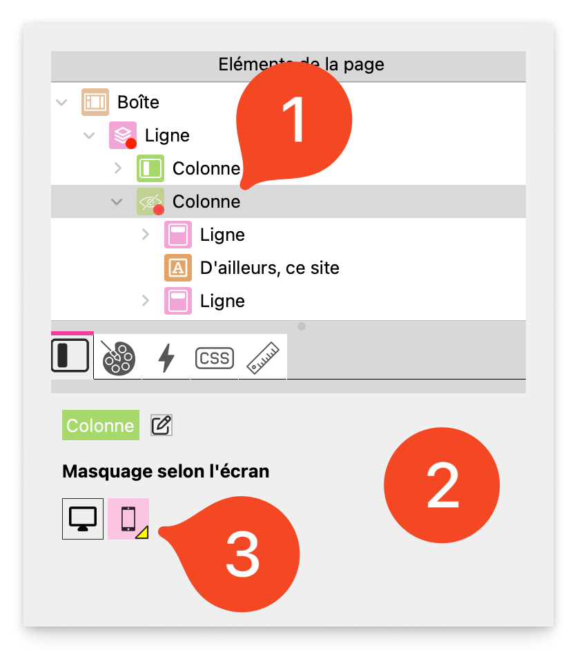
Hide screen elements
If an element is too complex for a small screen, it can be hidden according to screen size.
Select an element.
Access visibility options (in the properties on the right).
Check or uncheck the options to show or hide the item on Desktop, Tablet or Mobile.
Test and finalize the display
Switch to mobile mode regularly to check rendering.
Adjust margins and spacing to avoid elements that are too tight.
Use the preview (Cmd + T / Ctrl + T) to see the rendering in real conditions.
Best practices
Use a flexible column structure for greater adaptability.
Activate Cascade mode on certain lines to avoid misaligned elements on mobile.
Use a Break in a line if it has to pass under the others from a given screen.
Test each display mode before publication.
Optimize images and text to ensure readability on all screens.