The dynamic menu
The dynamic menu makes it easy to navigate your site by offering you a system of menus and sub-menus. You can organize the menu entries as you wish.
Here are a few simple steps on how to build a responsive menu for mobile phones
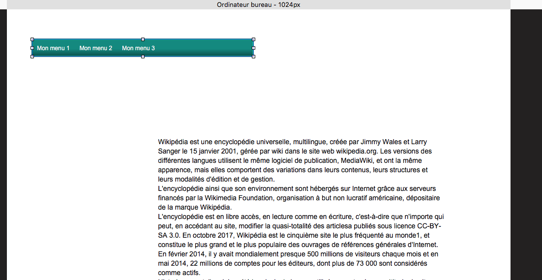
On the desktop screen, create a new menu
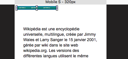
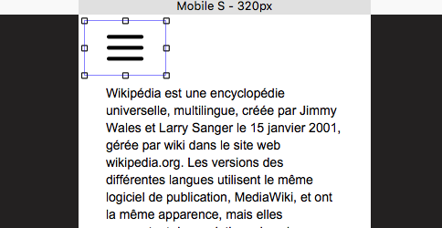
Switch to the mobile screen.
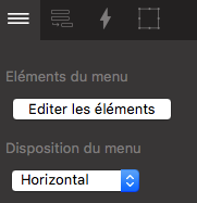
Change the ‘menu layout’ property

Adjust the dimensions of the component
Note
Option floating menu A very interesting property for navigation that will allow you to have the menu always available (when it is hidden by the scrolling of the page)