Notion of grid
The principle of a grid
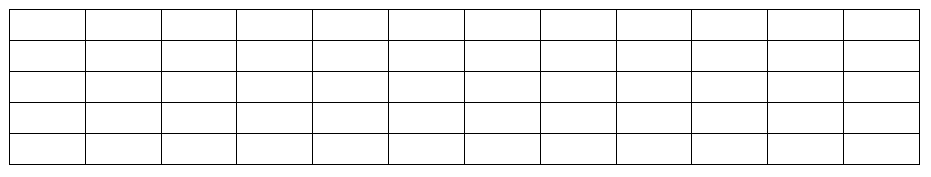
A grid is simply a cut into cells of the same dimensions as shown below:
The Bootstrap grid has 12 columns.
Terminology
A grid is divided into rows (called “row” in Bootstrap and “Line” in WebAcappella RC) and columns (“col”), as in the following figure :
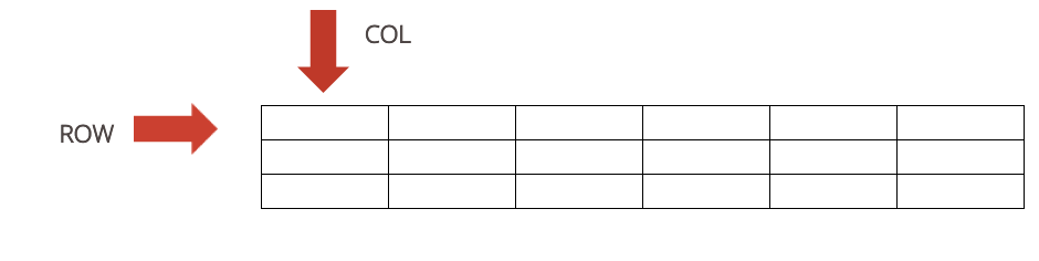
The Bootstrap Grid
Column division divides the screen width into percentages. For the rows, however, the height will be adjusted to the content.

Organization of the grid
Bootstrap considers 4 kinds of media:
Large (Lg) |
Bn |
Sm |
Xsmall (Xs) |
|---|---|---|---|

|

|

|

|
Reference value |
Reference value |
Reference value |
Reference value |
>= 1200 px |
>= 992 px |
>= 768 px |
< 768 px |
And in WebAcappella Grid?
A grid is defined in WAGRID by the ” BOX ” button which will contain as many rows as desired with always a maximum width of 12 columns per row.
A line (row in Bootstrap) will contain elements (text, image, etc.).
The 2 major components are the “BOX” and the “LINE”.
Note
BOX: This is the primary (and therefore indispensable) component, the only one where lines can be added.
Note
LINE: Component that allows you to include images, text, a gallery, etc.
A row is divided into 12 columns (see bootstrap), a component such as an image can be at least 1 column wide and at most 12 columns wide.
In total, we can therefore have 12 components of 1 unit width.
Concerning the height of a line, it depends on the size of the width of the inserted component(s) (notion of ration for an image, notion of content for the text in particular).
The notion of ratio refers to a notion of proportionality (width*height) and therefore of “resizing” an image.
The content has a notion of “fluidity”, i.e. the content must in all cases appear and therefore if you reduce the width (loss of content therefore), this will inevitably be compensated by a gain in height.
The spacer is a separate component in the sense that it has a fixed size, which makes it possible to generate a margin.